How to Read a Candlestick Chart

Key takeaways
- A candlestick chart shows how a crypto price moved over time. Each candle covers one time period you choose.
- One candle tells you four prices: the open, the close, the high, and the low for that period.
- The body shows the open and close; the thin wicks show the high and low. Green usually means the price rose; red means it fell.
- Common shapes like a doji or a hammer can hint at what buyers and sellers were doing — but they are not predictions or guarantees.
- Candlesticks are one tool among many. Combine them with other information, and never trade more than you can afford to lose.
Open any crypto trading screen and you will see rows of small green and red bars. These are candlesticks, and they are the most common way to show how a price has moved. At first they look busy, but each candle follows a simple pattern. Once you learn to read one candle, you can read the whole chart.
This guide explains what a candlestick chart is, how to read a single candle, how the timeframe changes what you see, and what a few common shapes can suggest. It is written in plain English for beginners, with no jargon left undefined.
Who this guide is for:
- Beginners who keep seeing candlestick charts and want to understand them.
- Anyone learning the basics of reading crypto price charts.
- People who want a calm, honest explanation — not a "secret pattern" sales pitch.
Charts are just one part of the bigger picture. For the wider context, see our overview of technical analysis basics, then come back here to focus on the candles themselves.
What is a candlestick chart?
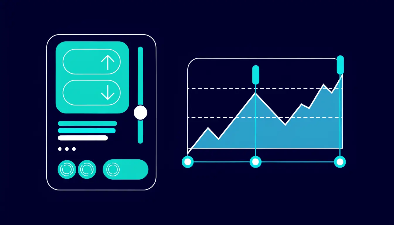
A candlestick chart is a picture of how a price moved over time. The bottom of the chart is time, moving left to right, and the side is price, moving up and down. Instead of a single line, the price is drawn as a series of small shapes called candles.
Here is the key idea: each candle stands for one time period. If you set the chart to one hour, every candle sums up one hour of trading. Set it to one day, and every candle sums up a whole day. A row of candles side by side shows you how the price travelled across many of those periods.
That is why traders like candles. A plain line only shows one price at each moment. A single candle packs in four prices for its period at a glance — where trading started, where it ended, the highest point, and the lowest point.
Simple analogy: think of each candle as a short daily diary entry for the price. It records how the period opened, how it closed, and the highs and lows in between.
The anatomy of a single candle
Every candle has two parts: a thick middle called the body and thin lines above and below called wicks (also called shadows). Together they show the four prices for that period.

The body shows the open and the close — the price at the start of the period and the price at the end.
- Green (or up) candle: the price closed higher than it opened. The bottom of the body is the open; the top is the close.
- Red (or down) candle: the price closed lower than it opened. The top of the body is the open; the bottom is the close.
The wicks show how far the price reached during the period. The tip of the upper wick is the high — the most expensive point. The tip of the lower wick is the low — the cheapest point. If a candle has no wick on one side, the price did not travel past the body in that direction.
So a tall green body with short wicks means buyers pushed the price up steadily. A short body with long wicks on both sides means the price swung around a lot but ended near where it started. Colours can be changed in most apps, so always check whether up is green or another colour on your screen.
How to read the timeframe
The single most important setting on a candlestick chart is the timeframe — how much time each candle covers. Every trading app has a small menu, often showing choices like 1m, 15m, 1H, 4H, 1D, or 1W. These mean one minute, fifteen minutes, one hour, four hours, one day, and one week per candle.
The timeframe changes what you see, even though the price itself has not changed. On a 1-minute chart, one hour of trading is 60 candles, and every tiny wobble shows up. On a 1-day chart, that same hour is only part of a single candle, so the small wobbles disappear and the bigger trend stands out.
Neither view is "right" or "wrong" — they answer different questions. A short timeframe shows recent, fast movement. A long timeframe shows the broader direction over weeks or months. Many beginners find short timeframes stressful and noisy, because prices jump around far more up close.
Tip: if a chart looks wild and confusing, check the timeframe first. Switching from a 1-minute to a daily view often makes the same price far easier to understand. Crypto prices move fast — our guide to what crypto volatility is explains why.
Common candlestick shapes (and what they can suggest)
Because a candle records four prices, its shape tells a small story about the tug-of-war between buyers and sellers. Over the years, traders have given names to a few common shapes. These shapes can suggest what happened — but they are hints about the past, not a crystal ball for the future.

- Long body: a tall body with small wicks. It suggests one side was clearly in control for the whole period — buyers if it is green, sellers if it is red.
- Doji: a candle with almost no body, because the open and close are nearly the same. It suggests buyers and sellers were evenly matched, a moment of indecision.
- Hammer: a small body near the top with a long lower wick. It suggests the price dropped during the period but buyers pushed it back up before the close.
- Long wicks: long lines above or below the body show the price reached far in that direction, then came back. A long upper wick suggests sellers pushed the price back down from a high.
Notice the careful wording: every shape "suggests." A doji does not mean the price is about to turn. A hammer does not mean the price will rise next. These are descriptions of what already happened, not instructions for what happens next.
Warning: candlestick patterns do not predict the future and offer no guarantees. The same shape can be followed by a rise, a fall, or nothing at all. Anyone promising sure profits from a pattern is misleading you. Treat shapes as clues to investigate, never as signals to act on blindly.
Using candlesticks sensibly
A candlestick chart is one tool among many — it is not a strategy on its own. The most sensible way to use candles is as a starting point for questions, then to check other information before you decide anything.
- Combine it with context. Look at the wider trend, recent news, and trading volume, not just the last candle. One candle in isolation tells you very little.
- Zoom out. Check a longer timeframe to see whether a shape sits inside a bigger up-trend, down-trend, or a flat, going-nowhere market.
- Stay humble. Even experienced traders are often wrong. A pattern that "worked" last time can fail the next time with no warning.
Most importantly, protect your money before you worry about charts. Never bet the farm on a single pattern. Position sizing, limiting losses, and only using money you can afford to lose matter far more than spotting the perfect candle. Start with our guide to risk management for beginners before you place any trade.
It also helps to understand how orders actually work, so a chart reading turns into a sensible action rather than a rushed click. See crypto order types explained for the basics.
Tips and common mistakes
Helpful tips
- Learn one candle before you learn "patterns." If you can read the open, close, high, and low, everything else builds on that.
- Always check the timeframe before you read anything into a candle. The same price looks calm or wild depending on it.
- Confirm the colours. Green is not always up — check your app's setting so you do not read a candle backwards.
- Practise on past charts. Scroll back in time and describe what candles show, with no money at stake, until it feels natural.
Common mistakes to avoid
- Treating a shape as a prediction. A hammer or doji describes the past; it does not promise the next move.
- Trading on one candle alone, without checking the wider trend, volume, or news around it.
- Staring at a 1-minute chart and reacting to every wobble. Short timeframes are noisy and stressful for beginners.
- Risking too much on a "clear" pattern. No pattern is clear enough to skip sensible risk limits.
Frequently asked questions
What does a candlestick show?
One candlestick shows four prices for a single time period: the open (start), the close (end), the high (the top), and the low (the bottom). Read together, a row of candles shows how a price moved over time.
What do green and red candles mean?
A green (or up) candle usually means the price closed higher than it opened during that period. A red (or down) candle means it closed lower than it opened. Colours can be changed in most apps, so confirm the setting on your screen.
What is a wick on a candle?
A wick, also called a shadow, is a thin line above or below the body. The tip of the upper wick is the highest price reached in that period, and the tip of the lower wick is the lowest price. A candle can have wicks on both sides, one side, or neither.
Do candlestick patterns predict price?
No. Candlestick patterns describe what already happened; they do not predict or guarantee the future. The same shape can be followed by a rise, a fall, or no change. Treat patterns as one clue among many, not as a signal to act on by itself.
What timeframe should beginners use?
Many beginners find longer timeframes, such as the 4-hour or daily chart, easier to read because the price is less noisy. Very short timeframes like 1-minute jump around a lot and can be stressful. There is no single "correct" timeframe — pick one that matches the question you are asking.
Summary
A candlestick chart shows how a crypto price moved over time, with each candle summing up one period. A single candle tells you the open, close, high, and low: the body shows the open and close, the wicks show the high and low, and colour tells you whether the price rose or fell. The timeframe you choose changes how the same price looks.
Common shapes like the doji and hammer can suggest what buyers and sellers were doing, but they are hints about the past, not predictions. Use candles as one tool among many, combine them with other information, and never bet the farm on a pattern.
Next step: ready to see how candles fit the bigger picture? Read our overview of technical analysis basics, and if you plan to trade, learn the difference between spot and futures trading first.